I’ve been designing products for enterprise SaaS companies for eight years. Deutsche Telekom, IQVIA, D.E. Shaw Group. The kind of products where a bad UX decision costs millions and ruins someone’s quarterly bonus. Never mine, unfortunately.
Technical debt is familiar territory: ship fast, promise “we’ll refactor later,” codebase gets messy, developers slow down. UX debt works exactly the same way.
Except it’s worse.
Technical debt slows down your developers. UX debt slows down your users. Your developers work for you. Your users pay you.
What UX debt actually is
UX debt is every design shortcut you took to ship faster. Confusing labels. Features buried in settings. Modals interrupting users because you didn’t want to redesign the page. Someone said “just add a tooltip” instead of fixing the actual problem.

It’s the “we’ll fix it later” that never gets fixed. Most teams just keep building on top of it, like constructing a house on a foundation of Post-it notes.
- Onboarding teaches features instead of getting users to their goal
- Dashboard shows 47 metrics at once when users need to see three
- Navigation has 12 options because every feature got its own menu item
- Settings page is 400 lines long
- Users ask support the same question 50 times a week because they can’t find the feature
If you’re reading this and thinking “how did she get into our Slack,” you have UX debt.
Why UX debt costs more than technical debt
Technical debt costs you developer time. You’re paying engineers to work around bad code, refactor systems, and maintain complexity.
UX debt costs you:
1. Support team time
Confusing interfaces create support tickets. Buried features generate “how do I…” questions. Unclear error messages trigger conversations. And every time you use the word “Actions” as a button label, an angel loses its wings.
One client I worked with – a B2B SaaS platform with about 2,000 enterprise users – was getting the same question 15-20 times per day: “How do I export my data?”
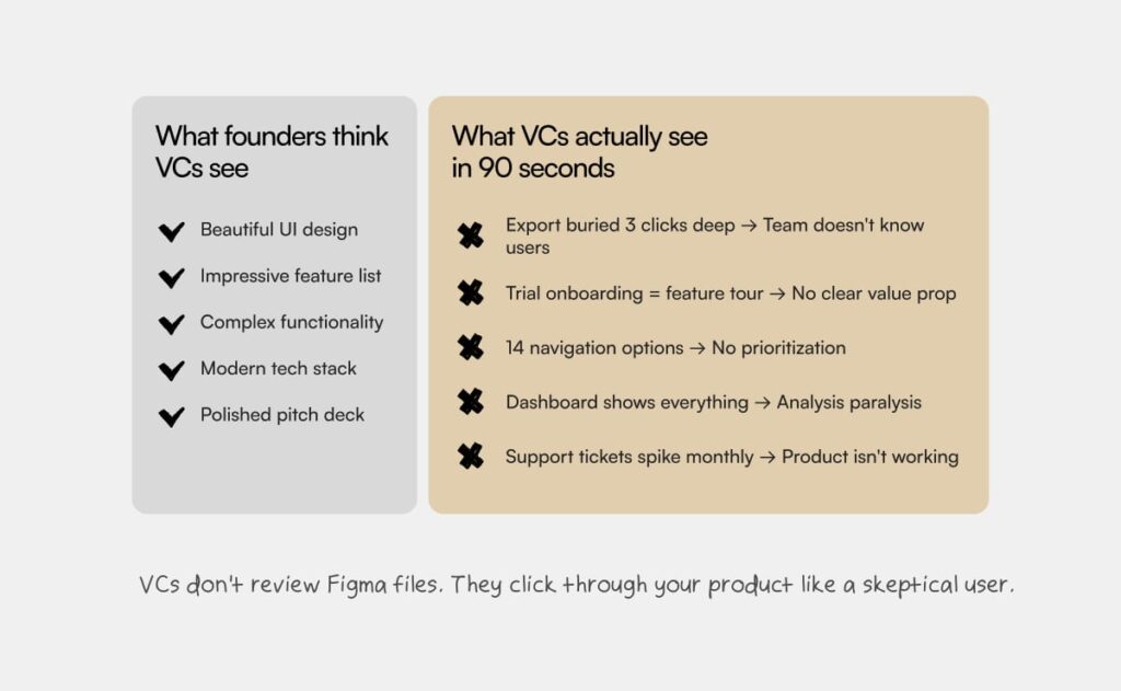
The export feature existed. It was just buried three levels deep in a dropdown menu labeled “Actions.”
We moved it to a clearly labeled “Export” button on the main dashboard. Support tickets dropped 30% in two weeks.
450 fewer tickets per month. 75 hours of support time saved. Every month. Until you bury another feature somewhere equally creative.
2. Onboarding failure
Bad UX doesn’t just frustrate existing users. It kills activation for new ones.
If your trial users can’t figure out how to do the thing they signed up to do, they don’t convert. They don’t tell you why. They just leave.
Teams blame this on messaging, pricing, or product-market fit. Sometimes it’s just that your onboarding is teaching them features when they wanted to solve a problem.
One client’s trial-to-paid conversion was stuck at 8%. The founder kept saying “users just don’t get the value.” They got it. They couldn’t reach it. Turns out users are smarter than founders think.
The problem: onboarding walked users through six features they didn’t care about yet, before letting them do the one thing they actually wanted to do.
We redesigned onboarding to get users to their first win in 90 seconds. Conversion went to 22% in six weeks.
Not from adding features. Not from changing pricing. From stopping the “welcome to our product, let us tell you about every single thing it can do” speech that nobody asked for.
Real example: Deutsche Telekom data hub
Deutsche Telekom needed an internal data hub for thousands of users across multiple national companies. The product worked technically, but adoption was terrible.
I spent three days watching people try to use it. One analyst opened the dashboard, stared at it for what felt like 30 seconds, then asked a colleague “which one do I click?”
Navigation had 14 options, nobody knew which one did what. Data export hidden three clicks deep under “Actions.” Dashboard default showed nothing useful. Error messages written for engineers: “NULL value returned in dataset query.”
The product had grown from 3 features to 30 over three years. Every new feature got added wherever there was space.
We fixed the top three problems in two weeks: collapsed navigation to 4 groups, made export a prominent button, changed dashboard default to show recent work.
Results: support tickets dropped 30%, feature adoption increased 40%. The teams that were barely logging in monthly started using it daily.
The UX debt triage framework
I don’t do comprehensive UX audits. Those take weeks and tell you things you already know. Plus nobody reads past slide 12.

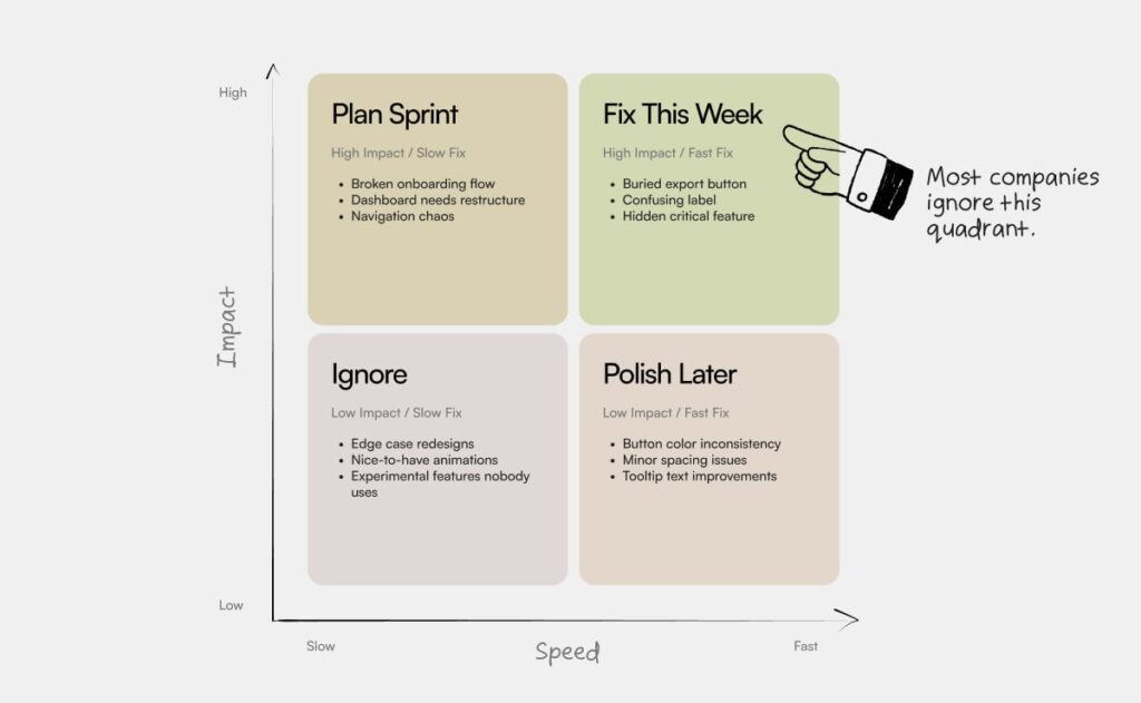
Instead, I identify 10-15 specific problems ranked by impact on users and speed to fix. Then fix 2-3 things immediately. Things users complain about constantly, support answers 20+ times per week, or are objectively broken.
When to fix UX debt vs when to ship new features
When do you stop building new features and fix what’s broken?
If you’re asking this, the answer is probably three months ago.
Fix UX debt when:
- Support is dominated by “how do I…” questions about existing features
- Users ask for features you already have (they just can’t find them)
- Trial-to-paid conversion is stuck below 15% despite good product-market fit
- Customer success has to “teach” every new user how to navigate
- Best features have low adoption despite being genuinely useful
Ship new features when:
- Users can accomplish their goals without constant support
- You’re losing deals because you lack functionality (not because existing product is confusing)
- Competitors are winning on features you genuinely don’t have
- Retention is strong but growth is limited by feature gaps
Most teams ship new features on top of broken UX. You already saw what happened when we fixed onboarding: 8% to 22% conversion. That’s more growth than most new features deliver.
What product teams get wrong about UX debt
Your product is not special. Your UX problems are not unique. The thing that’s slowing down your users – I’ve seen it 15 times before. Probably more. I stopped counting.
Most UX debt is embarrassingly fixable. Not theoretically fixable. Actually fixable. This sprint.
You know this. You’ve known it for months. You’re just hoping it’ll fix itself.
The reason it doesn’t get fixed isn’t because it’s hard. It’s because nobody prioritizes it. Everyone’s too busy shipping the next feature to fix what’s already broken.
Your users don’t care about your roadmap. They care whether your product helps them do their job without making them feel stupid.
If this is hitting close to home, I do focused UX work on exactly this. Not comprehensive audits. Not 12-week strategic plans. Just fixing what’s actually slowing you down.
