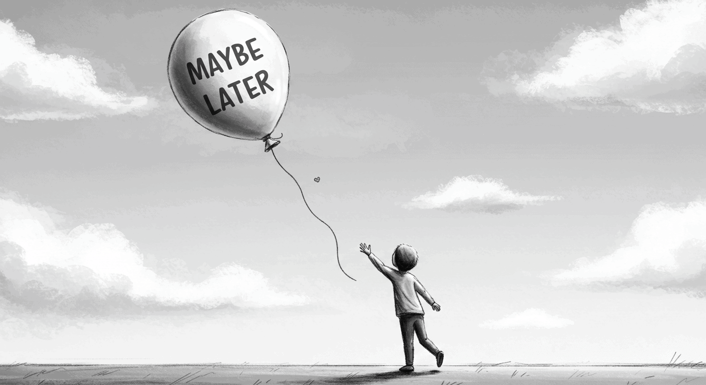
“Maybe Later” appears on modals, product tours, feature announcements, onboarding flows. It’s the soft opt-out — a peace offering to the overwhelmed new user. A UX safety valve.
The thinking behind it is reasonable: we don’t want to force anyone. Pushy onboarding is annoying. Users should have control.
The problem is what actually happens when you give it to them.
43% of users drop out of onboarding when given a skip or defer option. Users who complete onboarding are 3.5 times more likely to convert to paying customers than users who skip it. Products with high skip rates see two to three times more support tickets in the first 30 days.
“Maybe Later” almost always means never. And worse — it trains users to avoid learning your product at the exact moment they most need help.
What the Button Is Actually Doing
When you add a defer option to your SaaS user onboarding, you’re doing three things simultaneously, none of which are helping your product.
You’re asking users to choose ignorance before they understand what they’re ignoring. Someone who just signed up doesn’t know what the onboarding is going to show them. They don’t know whether it’s a six-step tour of features they’ll never use or the single piece of information that makes the product click. When you ask them to decide whether to engage before they have that context, most of them default to skipping — not because the onboarding isn’t valuable, but because the cognitive cost of engaging feels higher than the cognitive cost of dismissing.
You’re deferring friction rather than removing it. Every step they skip now becomes a support ticket later. The feature they dismissed becomes the thing they can’t find in month two. The guidance they deferred becomes the reason they churn in month three. You haven’t simplified their experience. You’ve moved the confusion downstream and made it more expensive to resolve.
You’re sending a signal about what matters. If the onboarding were critical, you wouldn’t make it skippable. That’s what users learn — consciously or not — from the presence of a defer button. The product is telling them “this is kind of useful, if you feel like it.” And most of them don’t feel like it. Not because they don’t want to succeed with the product, but because your own interface told them it was optional.
Why Teams Ship This Pattern Anyway
The defer button usually gets added for one of four reasons, none of which are good product thinking.
It feels safer. Teams that have been burned by clunky onboarding or intrusive popups overcorrect toward passivity. The memory of bad UX makes “let them skip” feel like the responsible choice.
It feels respectful. There’s a genuine confusion between user agency and user abandonment. Letting people skip feels like giving them control. It’s actually giving them permission to stay confused.
It’s fast. Adding a dismiss button takes five minutes. Figuring out why users hesitate in the first place takes much longer. The defer button is the cheap solution to a design problem that hasn’t been properly diagnosed.
It provides plausible deniability. “We offered education. They didn’t want it.” This sounds like product thinking. It isn’t. It’s outsourcing your design problem to users who don’t have the context to solve it.
What the Data Shows
The compounding effect of skippable SaaS user onboarding runs on a predictable timeline.
Month one: 43% skip. The majority of new users dismiss the guidance before it reaches them.
Month two: support tickets increase at two to three times the rate of products with completed onboarding. Users who skipped the tour are now encountering every confusion the tour would have prevented.
Month three: the users who skipped churn at significantly higher rates than users who completed onboarding. Not because the product failed them — because the product never got the chance to show them what it could do.
By month six, teams are building features to fix confusion that proper onboarding would have prevented in week one.
The math is straightforward: every defer button click is a trade of onboarding time for support time. Support time costs more, scales worse, and comes too late to save the user who needed help in the first session.
What to Do Instead
This isn’t an argument for forced tours or blocked interfaces. It’s an argument for onboarding that’s designed for hesitation rather than avoiding it.
Make guidance native rather than interruptive. The worst SaaS user onboarding announces itself — a modal appears immediately after signup, blocks the interface, and asks users to engage before they’ve oriented themselves. Better onboarding appears when it’s relevant. Inline prompts that surface when users reach a specific point in a workflow. Contextual cues that appear when a feature is first encountered. Guidance that’s part of the interface rather than an overlay on top of it.
The distinction matters because interruptive onboarding creates the exact hesitation that leads to skipping. Native onboarding feels like the product helping you do something, not the product asking you to sit through a tutorial.
Anchor onboarding to outcomes, not features. Most SaaS product tours teach mechanics: “here’s how to use filters, here’s how to export data, here’s how to invite team members.” Users don’t care about mechanics. They care about results.
The difference between product onboarding that works and product onboarding that gets skipped is often this: one teaches “how to use the feature” and one teaches “how to accomplish the thing you came here to do.” When users understand that completing the onboarding step gets them to their goal faster, the motivation to engage changes.
If someone insists on skipping, add friction — not a block. There’s a middle ground between “maybe later, totally fine” and “you cannot proceed without completing this.” If a user wants to dismiss guidance, let them. But slow it down enough to signal that this matters.
“Are you sure? This takes less than 30 seconds and helps you avoid the most common setup mistakes.” That’s not coercion. That’s context. You’re not blocking them — you’re making them think twice before choosing confusion.
Bad onboarding UX says: want to skip? Cool. Good onboarding UX says: you can skip, but here’s what you’ll miss.
Make help permanently findable. If users skip or dismiss guidance, they shouldn’t lose access to it. Poor onboarding hides help — the tour that was dismissed is gone, the guidance that was skipped can’t be found again. Good onboarding makes help permanently accessible.
A persistent “need help?” in navigation. Walkthroughs accessible from within the product, not through a support ticket. Progress indicators that show users exactly where they are and what they haven’t done yet. Empty states that guide rather than just confirm absence.
The goal is to make the cost of re-engaging with guidance lower than the cost of staying confused.
The Design Problem Behind the Button
Defer buttons persist in SaaS user onboarding because they’re a symptom of a design problem that hasn’t been properly addressed.
When users hesitate at an onboarding prompt, the question isn’t “should we let them skip?” The question is: why are they hesitating? Is the prompt appearing at the wrong moment? Is the copy unclear about what the onboarding will actually do? Is the flow too long? Is it asking users to engage before they’ve had any reason to trust the product?
These are solvable problems. The defer button is a way of not solving them.
Good SaaS user onboarding doesn’t ask permission. It doesn’t apologise for existing. It assumes users want to succeed — because they signed up, which means they do — and it guides them there clearly and quickly. It becomes part of the interface rather than an interruption of it. And when someone truly wants to skip? Fine. But it doesn’t offer the option like a courtesy. It makes them insist.
“Maybe Later” feels like good UX. It’s polite. It’s flexible. It gives users control.
It’s also how you lose 43% of your new users before they understand what they signed up for.