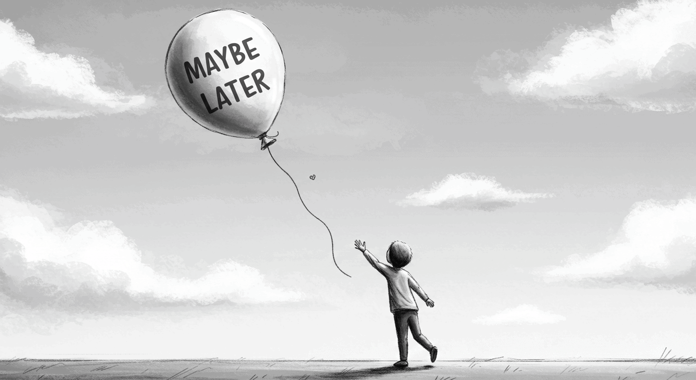
It sounds harmless. Polite, even.
“Maybe Later” — the soft opt-out on your modal, onboarding flow, or product tour. A UX safety valve. A peace offering to the anxious user.
But here’s the problem: “Maybe Later” almost always means “Never.”
And worse — it trains users to avoid learning your product at the very moment they most need help.
This post isn’t a rant. It’s a teardown. Of why defer buttons do damage to onboarding flows. Of how they quietly sabotage product clarity. And of what better design patterns look like — especially for SaaS teams juggling activation, education, and growth.
Let’s break it down.
What ‘Maybe Later’ Is Actually Doing
When you give users a “Maybe Later” button during user onboarding, you’re doing at least three things — none of which are helping your product.
You’re Making the User Choose Ignorance
You’re asking someone who just signed up, or just discovered a new feature, to decide whether they want to learn more — before they understand why it matters.
That’s like pausing a cooking tutorial after 30 seconds and asking: “Want to skip the part about the oven?”
They say yes, because they’re overwhelmed. But they pay for it later. User onboarding becomes optional at the exact moment it’s most critical.
You’re Deferring Friction — Not Removing It
Every click they skip now becomes a bump later. The user onboarding flow they dismissed reappears as support tickets. The feature they ignored turns into churn.
It’s delayed confusion. UX debt, wrapped in a friendly button. You haven’t simplified the experience. You’ve just moved the problem downstream.
You’re Sending the Message: “This Isn’t Important”
If it really mattered, you wouldn’t make it skippable. That’s what users learn, consciously or not.
The presence of a “Maybe Later” button devalues the thing you’re trying to promote. It’s the product saying, “We think this is kind of useful… but only if you feel like it.”
And most users don’t.
Why This Happens
So why do so many teams ship this pattern? Here’s the truth about why onboarding ends up with defer buttons:
It feels safer. No one wants to force users. We’ve all been burned by clunky onboarding and annoying popups. The memory of bad user experiences makes teams overcorrect toward passivity.
It feels polite. Letting people skip gives the illusion of control. But confusing “user agency” with “user abandonment” is a design mistake, not a kindness.
It’s fast. It’s quicker to slap on a dismiss button than to think about why users hesitate in the first place. Building effective user onboarding takes time. Adding “Skip” takes five minutes.
And most importantly: It gives PMs plausible deniability. “We offered education. They didn’t want it.”
But that’s not product thinking. That’s just UX outsourcing. You’re asking users to solve your design problem.
What the Research Says
Skipped onboarding hurts retention. According to a 2023 study by Appcues, users who completed user onboarding were 3.5× more likely to convert to paying customers than those who skipped it.
And yet? 43% of users dropped out of user onboarding when given a skip or defer option.
The conclusion: the more optional your guidance feels, the less likely users are to take it — and the more likely they are to miss the product’s value. Making user onboarding skippable doesn’t respect users. It abandons them.
Choice overload makes UX worse. UX research has consistently shown that too many options reduce decision quality (Iyengar & Lepper, 2000). This applies directly to user onboarding design.
Adding defer buttons to modals or flows creates a false choice: “Would you like to succeed later, or stay lost now?”
Most users default to skipping. Not out of logic — but because skipping is cognitively easier. Then they blame your product for being confusing.
First-time actions shape long-term habits. Behavioral design studies show that the first few sessions define user mental models.
If users start by opting out of guidance, they’re more likely to continue exploring in isolation — increasing frustration and dropout risk. Poor user onboarding patterns create users who never learn your product properly.
The support cost is real. Products with high skip rates see 2-3× more support tickets in the first 30 days. Every “Maybe Later” click becomes a support conversation later. You’re trading onboarding time for support time — except support is more expensive and less scalable.
And the compounding effect?
Month 1: 43% skip.
Month 2: Support tickets increase 2.3×.
Month 3: Those users churn at 67% higher rates.
By Month 6, you’re building features to fix confusion that proper onboarding would have prevented.
What to Do Instead
This isn’t a call for dark patterns or forced tours. It’s a push for clarity.
Here’s how to replace “Maybe Later” with something better:
Design Guidance That Feels Native — Not Interruptive
Instead of one big welcome tour, weave onboarding into natural moments:
Inline prompts that appear when users need them, not when you want to show them. Context beats interruption.
Contextual help buttons that users can access on their terms. Make education available, not mandatory but unavoidable.
Light overlays with clear skip logic — but no defer. If someone really wants out, let them escape. But don’t invite them to procrastinate with “Maybe Later.”
If something matters, it should be present when it matters — not buried in a dismissible drawer. Good product design guides users without blocking them.
Anchor Learning to User Goals, Not Features
Don’t teach “how to use filters.” Teach “how to find the right customer.”
Make user onboarding about outcomes, not mechanics. Then users want to engage. They’re not learning your interface. They’re accomplishing their goal, and the interface becomes obvious in the process.
This is the difference between product tours (here’s every button) and onboarding (here’s what you came here to do).
Make Skipping Possible — But Not Painless
If someone insists on skipping, let them — but use friction to slow it down just enough to signal importance.
For example: “Are you sure? This takes less than 30 seconds and helps you avoid common mistakes.”
That’s not coercion. That’s context. You’re not blocking them. You’re making them think twice.
Bad onboarding says: “Want to skip? Cool.” Good onboarding says: “You can skip, but here’s what you’ll miss.”
Give Them a “Come Back Later” Path — But Make It Visible
If users really aren’t ready, make sure they know where to find guidance later. Poor onboarding hides help. Good onboarding makes it permanently accessible.
Add a “Need help?” CTA to navigation. Don’t make users hunt for the tour they skipped.
Keep walkthroughs accessible, not hidden behind support. If someone wants to learn, don’t make them file a ticket.
Show progress. Let users see what they’re skipping. A progress indicator turns “I’ll do this later” into “I’m almost done, might as well finish.”
Better Examples to Learn From
Linear — minimal, yet confident
Linear doesn’t do a heavy onboarding flow. It drops you into a focused, calm UI that lets the core flows speak for themselves.
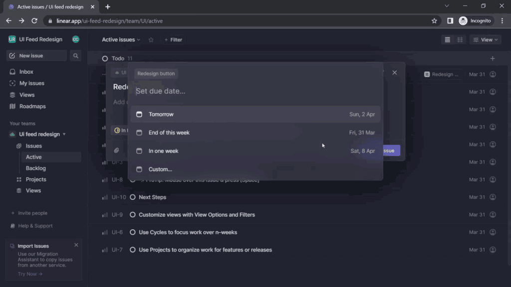
Their hover prompts are minimal and almost never block the screen. And guess what? There’s no “Maybe Later.” Because there’s no interruptive bloat to defer.
Postmark — walkthrough with a point
Postmark introduces new users to its email API features using a progressive, tab-based walkthrough that highlights what you can do and what you should do first.
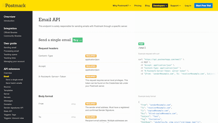
They don’t hide behind passive tips. They lead with intent — no defer buttons in sight.
Bad Example (Anonymised)
A well-known CRM tool launches a 6-step tour immediately after signup — with no explanation, poor copy, and a big “Skip All” in the corner.
Most users click it. Why? Because the tour interrupts before showing value. It’s a roadblock disguised as help.
The result? A dashboard full of unfamiliar tabs, zero direction, and a support request the next day. Because it looked optional, they skipped it. Because it wasn’t optional, they got lost.
That’s not onboarding. That’s user abandonment with a tooltip.
The fix would be simple: remove the tour entirely, embed guidance into the actual workflows, and stop pretending a 6-step walkthrough teaches anything except how to find the Skip button.
Final Thought
Good onboarding doesn’t ask permission. It doesn’t defer. It doesn’t apologize.
It assumes users want to succeed and guides them there. Quickly. Clearly. Confidently.
It assumes users want to succeed and guides them there. Quickly. Clearly. Confidently.
It doesn’t block the interface. It becomes part of it. Empty states that guide. Defaults that teach. Interfaces that make the right path obvious. And when someone really, truly wants to skip? Fine. But don’t offer it. Make them insist.
“Maybe Later” buttons feel harmless. They’re polite. Flexible. Non-committal.
But they’re also lazy.
They hide a deeper UX failure: the failure to design for hesitation. Instead of fixing why users hesitate, you give them an escape hatch and call it user-centered design.
Don’t nudge users into ambiguity. If something matters, help them do it — now.
Let go of the false comfort of deferral. If your product needs explaining, explain it clearly, quickly, and confidently through onboarding that actually works.
And if you need help doing that? Here’s how we approach product design, and who you’d be working with.
Because sometimes, the kindest thing you can do for users is refuse to let them skip learning your product.