When “make it pop” meets “increase conversions by 400%” — spoiler: math doesn’t work that way either.
Last year I turned down a marketing website project. Six figures. Dream client. The kind of work that pays for nice vacations and good therapy.
I said no anyway.
Four years ago, I would’ve said yes before they finished the brief. Marketing websites were my bread and butter. I had a process. I had case studies. I had that dangerous confidence that comes from not knowing how broken the industry actually is.
Now I know better. And knowing better means turning down work that makes everyone miserable — clients, users, and especially me.
The Impossible Math Problem
Every marketing website project starts the same way: a Zoom call where someone shows you their current conversion rate and asks you to perform mathematical miracles.
Their current site converts at 2.3%. They want 8%. "Is that realistic?" they ask, like I'm a fortune teller who specializes in statistical impossibilities.

Here's the math: going from 2.3% to 8% isn't just an improvement — it's a 248% increase. For context, that's like asking someone to triple your marathon time by changing your running shoes.

A realistic improvement might get you from 2.3% to 3.5%. Maybe 4% if their current site is genuinely broken and you fix actual problems. But 8%? That's not design. That's divine intervention.
But try explaining realistic expectations to a CMO who just returned from a conference where someone claimed their “simple design change” increased conversions by 340%.
(Spoiler: it didn’t, but the case study made great LinkedIn content.)
The Frankenstein Brief That Never Ends
Every marketing website design project starts with reasonable requirements. “Clean, modern, converts well.” Simple enough.
Then comes the real brief. Delivered via seventeen separate email threads, each more specific than the last:
“Can we add testimonials above the fold? Just three. Well, maybe five. Actually, we have twelve really good ones.”
“Legal needs a compliance section. Small. Just a paragraph. Oh, and the privacy policy. And terms. And cookie consent. And a disclaimer about our AI features.”
“The CEO wants his photo on the homepage. Not a big photo. Just prominent enough that investors notice.”
“We need to integrate the newsletter, the chatbot, the demo scheduler, and the assessment quiz. Seamlessly.”
By the time you’ve accommodated everything, your clean conversion-focused homepage looks like a digital yard sale. But everyone’s happy because their pet feature made it onto the page.
The fact that users now need a PhD in information architecture to find the actual signup button? That’s tomorrow’s problem.
The “Pop” vs. “Trust” Death Loop
The feedback cycle that broke me:
Round 1: “This looks too corporate. Can you make it pop more?”
So I add color, bigger fonts, some personality. It looks good. Modern, engaging, human.
Round 2: “This doesn’t look trustworthy enough. Our clients are enterprises.”
So I dial it back. Clean, minimal, lots of white space. Professional vibes.
Round 3: “It’s too boring now. It needs to grab attention.”
So I find the middle ground. Some color, but not too much. Some personality, but not too quirky.
Round 4: “Can you make it pop more? But keep it trustworthy.”
That’s when I realized we weren’t designing a website. We were trying to solve a physics problem with Figma.
The Attribution Nightmare (Or: How Everything Became My Fault)
Three months after launch, you get the email that makes your stomach drop:
“The new site isn’t performing as expected. Conversions are down 12%. We need to talk.”
So you dig into the analytics like a detective investigating your own alleged crime. Organic traffic dropped 30% because they launched during a Google algorithm update (classic timing). Paid traffic shifted because someone in marketing decided to “optimize” their ad targeting mid-campaign. The sales team started qualifying leads differently because they read a book about “higher-quality prospects.”
Oh, and their main competitor launched a product that’s genuinely better and costs half as much.
But none of these variables matter. The website launched, conversions dropped, therefore website = problem. It’s the kind of logic that would make a statistician weep.
I once spent a full day proving that a conversion rate drop was caused by the client’s sales team attending a three-day conference. The leads were there. The website was working. The salespeople were just… learning about synergy in Vegas.
Did this exonerate my design? Of course not. Correlation isn’t causation unless a website redesign is involved, apparently.
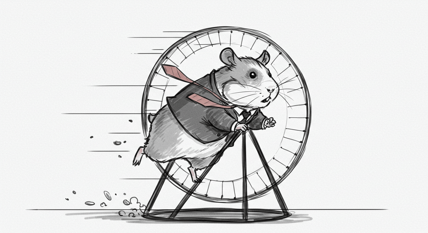
The Optimization Hamster Wheel
Marketing websites are never done. They’re “optimized.” Forever.
Every month:
“Can we A/B test the headline?”
So you test “Transform Your Business” vs. “Accelerate Your Growth” for three weeks. Result: 0.3% difference, well within margin of error.
But wait! That 0.3% could represent millions in revenue over time! (It won’t, but the math sounds compelling in a PowerPoint.)
I once spent four weeks testing whether a CTA should be orange or blue. Orange won by 0.7%.
Then we tested “Get Started” vs. “Start Free.” “Get Started” won by 0.4%.
Then we tested the placement.
Then the size.
Then the copy around it.
Six months later, I realized we’d optimized ourselves into a completely different website. One that converted 0.2% better than the original but felt like it was designed by a committee of anxious robots.
When I Knew I Was Done
The breaking point came during a project for a company that sold project management software. Nice product. Good team. Reasonable budget.
The brief: “Design a homepage that converts like Asana but looks like Notion.”
Two products with completely different value propositions, user bases, and business models. But they’d seen both companies’ homepages, so clearly we could just… combine them somehow.
After three rounds of design, we landed on something that looked like Notion and converted like neither.
Then came the feedback that ended my marketing website career:
“This is great, but can you make it convert 300% better? We promised the board we’d triple our conversion rate with the redesign.”
I asked what their current conversion rate was.
“2.1%.”
So they wanted 6.3%. From a homepage redesign. For a product in a crowded market with a complex sales cycle.
“How exactly did you promise that?” I asked.
“Well, we saw a case study where a redesign increased conversions 3x (not by 300%, btw, Alex!)”
I looked up the case study. It was about changing a broken checkout flow that was literally preventing purchases from completing. Their homepage was fine. Their product was fine. Their problem was that their market was saturated and their pricing was 40% higher than competitors.
But sure. A new hero section would totally solve that.
The Real Problem
Here’s what I finally understood: most marketing website design projects aren’t really about design. They’re about avoiding harder conversations.
It’s easier to redesign a homepage than to admit your product isn’t differentiated enough.
It’s easier to optimize conversion funnels than to fix your sales process.
It’s easier to A/B test button colors than to question whether you’re targeting the right market.
The website becomes a scapegoat for every business problem that’s too complex or politically dangerous to address directly.
What Actually Drives Conversion
The marketing websites that performed best in my experience weren’t the ones with the most aggressive optimization. They were the ones where:
- The product actually solved a problem people cared about
- The company understood their customers well enough to speak their language
- The sales and marketing processes worked smoothly after someone converted
- The pricing made sense relative to alternatives
Funny how none of those are design problems.
The best converting homepage I ever designed took two days. Clean layout, clear value prop, obvious next step. It converted well because the product was genuinely useful and the company knew who they were selling to.
The worst converting homepage took six months, had seventeen different CTAs, and went through forty-three rounds of feedback. It looked “optimized” but felt desperate.
Why I Stopped
I realized I was enabling a kind of thinking that hurts everyone involved.
Clients got false confidence that design could solve business problems it can’t solve.
Users got websites that treated them like conversion targets instead of humans with actual needs.
I got stress-induced insomnia and a growing pile of projects that looked good in case studies but didn’t actually help anyone.
The last straw was a client who blamed their Q3 revenue miss on the website’s “suboptimal conversion performance,” despite the fact that:
- Their biggest competitor had just launched a better product
- Two key salespeople had quit mid-quarter
- Their pricing was completely out of line with market reality
But the website was easier to blame than any of those things.
What I Do Now
These days I work on product design and UX problems. Things where design can actually make a difference.
When someone asks about marketing websites, I ask them:
- Do people who sign up for your product actually use it?
- What happens after someone fills out your contact form?
- How do your current customers describe your product to their friends?
- What would happen if your homepage disappeared tomorrow?
If those answers aren’t encouraging, no amount of conversion optimization will fix their growth problems.
If those answers are encouraging, they probably don’t need a “high-converting marketing website.” They need a clear, honest site that gets out of the way.
The Hard Truth
Marketing and website design projects fail because they’re trying to solve the wrong problem.
The problem isn’t that your website doesn’t convert enough visitors. The problem is that most of your visitors aren’t good fits for your product, and the ones who are don’t trust you enough to take the next step.
A redesign might bump your conversion rate from 2.1% to 2.8%. That’s not bad! But it’s not the 6% someone promised the board.
Real conversion improvement comes from better product-market fit, clearer positioning, smoother sales processes, and building genuine trust with your audience.
All of which are harder than changing button colors. But also more likely to actually work.
I still design things for the web. I just stopped pretending that web design can fix business problems that aren’t really design problems.
Turns out there’s a whole world of actual design challenges out there. Problems where the right interface can genuinely make someone’s day better, their work easier, their goals more achievable.
That’s the stuff worth staying up late for.