I rewrote an error message last month. Changed it from “Oops! Something might’ve gone a teensy bit wrong 🙈” to “This failed. Here’s why.”
Form completion rate went from 64% to 91%.
Same form. Same functionality. Different product copy.
Your product is too nice. Everything says “maybe.” Every modal wants to know if it’s a good time. Every tooltip apologizes for existing. It’s all lowercase and softly rounded – like if Helvetica developed social anxiety and started therapy.
You want to be helpful, human, inoffensive. You want to sound like a warm breeze that wouldn’t hurt anyone’s feelings.
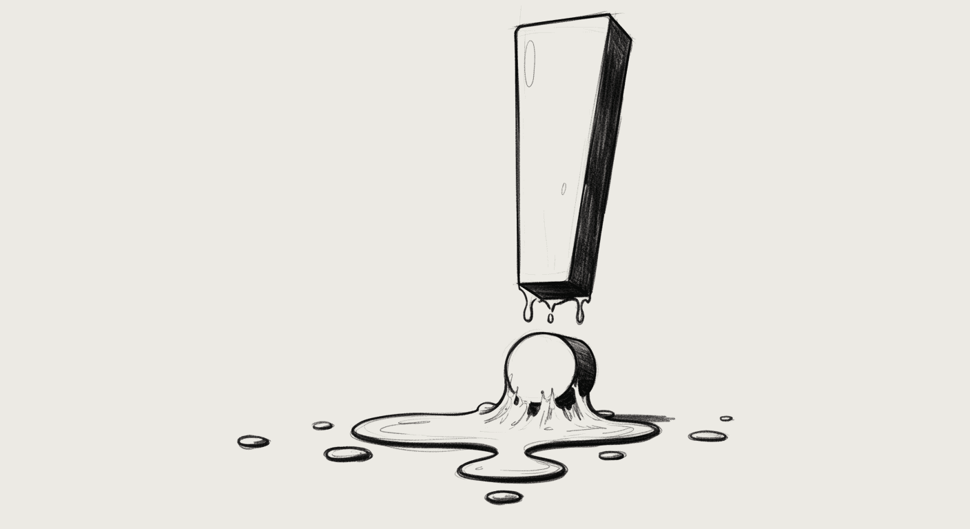
But here’s the problem: no one trusts a UI that whispers.
Why Your Product Copy Sounds Like It Has Social Anxiety
Modern UX writing is obsessed with friendliness. But friendliness isn’t clarity.
You’ve seen this voice everywhere:
The error message that says “Whoopsie! Looks like something went a little sideways there!” instead of explaining what actually broke.
The empty state that chirps “Nothing to see here yet, but that’s totally okay! 💙” when you need to know what to do next.
The delete confirmation that asks “Are you super duper sure you want to say goodbye to this?” instead of stating the consequences clearly.
The loading spinner that says “Hang tight, we’re working our magic! ✨” for 45 seconds while you wonder if it’s actually broken.
Everything is lowercase and apologetic, like an email from someone who’s afraid they’re bothering you. Which they are.
What this UX copywriting doesn’t tell you:
- What happened
- What to do next
- Whether the product is in control
- If you should panic yet
It’s all just slightly damp. Like sad toast.
I worked with a client whose signup flow said “Let’s get you set up!” followed by “This might take a sec!” followed by “Almost there, promise!” followed by “You’re doing great!”
Users weren’t doing great. 52% abandoned at step 3. Not because the form was hard. Because the product copy sounded like it was also filling out the form for the first time and wasn’t sure if it was doing it right.
The Over-Polite UX Writing That’s Destroying User Trust
Politeness avoids conflict. Real UX writing helps people make decisions.
When your product won’t commit to anything – a flow, an action, a sentence – users start assuming you can’t.
Because clarity signals competence. And wishy-washy microcopy UX signals uncertainty.
Here’s what users actually hear when your interface is too polite:
You write: “Oops! Something might’ve gone wrong, but we’re not totally sure!”
They hear: “Our error logging is broken. We have no idea what happened. Good luck.”
You write: “This is taking a little longer than usual! Hang in there! ☺️”
They hear: “It’s probably broken. Should you reload? We won’t tell you. Surprise!”
You write: “Feel free to reach out if you need help!”
They hear: “We’re not going to explain anything. Figure it out or email us.”
You write: “You might want to consider possibly saving this maybe?”
They hear: “We’re not confident about anything, including whether this save button works.”
Every hedge makes you sound less competent.
Real Examples: Product Copy I’ve Rewritten (And What Changed)
I’ve rewritten hundreds of over-polite interfaces. Here’s what actually worked.
Example 1: The Apologetic Error Message
Before: “Oops! 😅 Looks like something went a teensy bit wrong there. Mind giving it another try?”
Problems:
- “Oops” infantilizes the error
- “teensy bit” minimizes what might be serious
- “Mind giving it another try?” puts responsibility on user
- Emoji makes serious failures feel trivial
After: “Upload failed. File size exceeds 10MB limit. Compress and try again.”
What changed:
- States the problem clearly
- Explains the cause
- Gives specific action
- No apologizing
Result: Error recovery rate: 41% → 78%
People don’t need comfort. They need information.
Example 2: The Wishy-Washy Confirmation
Before: “Are you totally sure you maybe want to delete this workspace? You might lose some stuff and that could be not great! 🤔”
Problems:
- “totally sure you maybe” is contradictory
- “some stuff” is vague and terrifying
- “could be not great” dramatically understates consequences
- Question format weakens commitment
After: “Delete workspace? This is permanent. All projects, files, and team access will be removed.”
What changed:
- Direct question
- States consequences clearly
- No hedging
- Respects user intelligence
Result: Accidental deletions: down 64% (because people actually read it now)
Example 3: The Over-Excited Empty State
Before: “Looks like nothing’s here yet, but that’s totally okay! When you’re ready, maybe add some content and watch this space come alive! 🌟”
Problems:
- “totally okay” when it’s clearly not the desired state
- “maybe add” sounds optional
- “watch this space come alive” is marketing fluff
- Emoji enthusiasm feels forced
After: “No projects yet. Create one to get started.”
What changed:
- States current state
- Clear next action
- One sentence, not three
Result: First project creation: 23% → 54%
Empty states need clarity, not cheerleading.
Example 4: The Endless Loading State
Before: “Just a sec… ⏰”
Reality: 45 seconds and counting
Problems:
- “Just a sec” is a lie when it takes longer
- No progress indication
- No explanation
- Users don’t know if it’s broken
After: “Processing payment… (Usually takes 30-60 seconds)”
What changed:
- Honest timeframe
- Explains what’s happening
- Manages expectations
Result: Reload attempts during processing: down 71%
If it takes a minute, don’t say “just a sec”. Say it takes a minute.
Example 5: The Vague Support Offer
Before: “Feel free to reach out if you need help! We’re here for you! 💌”
Problems:
- “Feel free” is non-committal
- No contact method specified
- No indication of response time
- Emoji makes it feel less serious
After: “Questions? Email support@product.com – we respond within 2 hours.”
What changed:
- Direct contact method
- Response time commitment
- Concrete, actionable
Result: Support emails sent: up 120% (because people knew how)
Why Teams Keep Writing Wishy-Washy Microcopy (And Why It Backfires)
I’ve watched teams debate UX writing examples for hours. Same pattern every time:
Designer writes: “Upload failed. Try again.”
Marketing says: “Too cold. Add personality.”
Legal says: “Add disclaimers.”
Support says: “Make it friendlier so they don’t email us.”
Result: “Oopsie-daisy! 😊 We had a tiny hiccup uploading your file! No worries though – why not give it another teensy try? (Note: file uploads may occasionally experience technical difficulties.)”
What started as clarity became… whatever that is.
Teams are scared to sound:
- Wrong (so they hedge everything)
- Pushy (so they suggest instead of instruct)
- Confident (so they apologize preemptively)
- Adult (so they infantilize serious actions)
And then:
- No one takes action
- No one finishes onboarding
- No one believes your product is serious
- Everyone emails support asking what just happened
Soft copy feels safe. But it costs conversions.
UX Writing Examples: What Confident Product Copy Actually Looks Like
Here’s what you should be writing instead:
| Situation | Weak Copy | Strong Copy |
|---|---|---|
| Error | “Oops! Something went wrong 😅” | “Login failed. Check your password and try again.” |
| Delete | “Are you sure you maybe want to delete?” | “Delete account? This is permanent.” |
| Wait | “Hang tight! Working our magic! ✨” | “Processing… This takes about 30 seconds.” |
| Empty | “Nothing here yet, but that’s okay! 🎉” | “No messages. Start a conversation.” |
| Success | “Yay! We did it! High five! 🙌” | “Saved.” |
Does it sound blunt? Yes.
Does it make you sound confident? Also yes.
This isn’t about being rude. It’s about being useful. Users don’t need emotional support from their software. They need clear instructions.
How to Fix Over-Polite Interface Copy Without Sounding Like a Robot
You don’t need to become cold. You need to become clear.
Ask yourself:
- Am I giving instructions or suggestions?
- Am I stating facts or hedging feelings?
- Am I actually helping or just avoiding awkwardness?
The diagnostic test:
Would your product copy sound the same if it were delivering bad news?
If your interface says “Oopsie! Something went sideways! 🙈” for both “we charged your card” and “we lost your data,” you have a tone problem, not a personality.
Before you ship copy, remove:
- Unnecessary hedging (“might,” “maybe,” “possibly”)
- Emoji that trivialize serious actions
- Apologies for functionality working correctly
- Questions that should be statements
- Baby talk in professional contexts
Replace with:
- Direct statements
- Specific information
- Clear next steps
- Honest timeframes
- Respectful brevity
If legal requires disclaimers, put them in separate fine print. Don’t let them infect your primary UX writing.
If marketing wants personality, let them write the blog. Keep the UI clear.
Soft tone is easy. Sharp product copywriting is hard.
But sharp is what builds trust. Because when something goes wrong – and it will – users need to know you understand what happened and how to fix it.
If your product never says anything clearly, it’s not being polite. It’s being evasive.
So be nice. But be direct. Be warm. But be honest. Clarity isn’t cold. It’s respect.
Don’t let your buttons whisper. Say the thing.