Product UX
How the product behaves after sign-up: onboarding, flows, states, in-product copy, and UX debt.
_
Good for: PMs, founders and designers who want to fix activation, reduce friction and stop “tiny” UX decisions from quietly killing usage.
I ran a UX audit on a SaaS product last year. The founder wanted a redesign: “Everything feels cluttered. Users get confused. We need to start fresh.” The audit revealed 47 features in the interface. Users actively used 12. The other 35? Dead weight. Legacy toggles from 2019. Settings nobody changed. Flows that led nowhere.…
A client came to me with 18 months of traction, 2,000 active users, and an MVP that looked like it was styled with inline CSS and prayers. Which it was. The founder defended it: “It’s scrappy. It works. Our users don’t care about design.” Then I showed him the dropout metrics: 47% abandoned signup at…
I launched a new dashboard tab. No bugs filed. No complaints. No support tickets. My team celebrated: “Clean launch!” Three weeks later: 23% churn rate. The feature nobody complained about was the feature nobody used. They didn’t rage-quit. They just drifted away. Silent churn is the worst kind of failure. It doesn’t show up in…
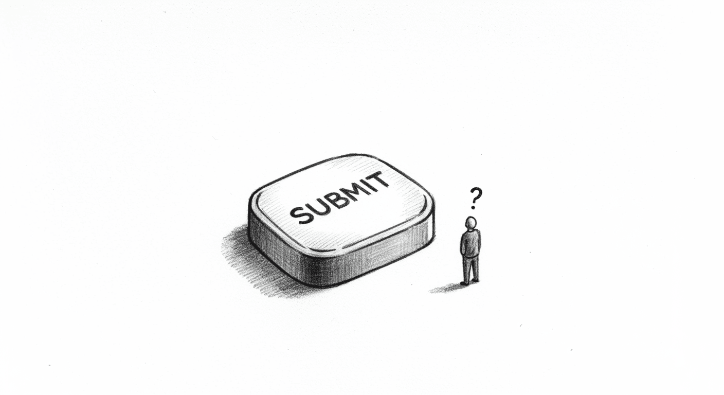
I shipped a “Save draft” button that didn’t save drafts. For three months. The button looked active. It had hover states. It showed a success toast: “Draft saved!” It did everything except the one thing it promised – actually save anything. The backend wasn’t ready. The feature was planned. Marketing needed screenshots. So I left…
I redesigned Notion’s empty states without permission. Took me 4 hours on a Saturday. Notion didn’t ask. They probably don’t care. But I learned more in those 4 hours than I did in a month of client work. This isn’t a pitch. It’s not a teardown. And it’s definitely not spec work. It’s a reflex.…