Product UX
How the product behaves after sign-up: onboarding, flows, states, in-product copy, and UX debt.
_
Good for: PMs, founders and designers who want to fix activation, reduce friction and stop “tiny” UX decisions from quietly killing usage.
Every product accumulates UX/UI debt. Cluttered flows. Unloved screens. Ghost features no one uses but everyone’s too scared to remove. The digital equivalent of that junk drawer in your kitchen — you know it’s a mess, you just don’t know where to start. Here’s the catch: fixing everything at once isn’t just unrealistic. It’s usually…
Series A fintech startup. $12M raised. Hired “top-tier” agency for complete product redesign. Six weeks, $85K, beautiful deck. Launched Tuesday morning. Thursday: support tickets flooding in. Users couldn’t find basic features. Onboarding completion dropped from 68% to 34%. Developers filing bugs about flows that made no technical sense. Friday: emergency call. What I found: Every…
Got an email Tuesday morning. “Hey, can you do a quick design audit? We think our dashboard needs a refresh. Shouldn’t take long — just want to check if anything looks off. Can you turn it around by Friday?” Friday was four days away. “Quick design audit” is the second-most optimistic phrase in product development.…
Most products I audit have great onboarding flows, polished dashboards, carefully designed settings pages. Then you hit the empty state and it’s like someone gave up. A clipart illustration. Generic copy that sounds like it was written by committee. Zero help on what to do next. Your user onboarding can be perfect, but if users…
There’s a reason your UX copy reads like it was written by a sentient HR policy. It probably was. Not literally. But by the time your crisp, punchy, human line made it through your product lead, your marketing head, your legal review, your VC’s opinion, and your cousin who “has a way with words,” it…
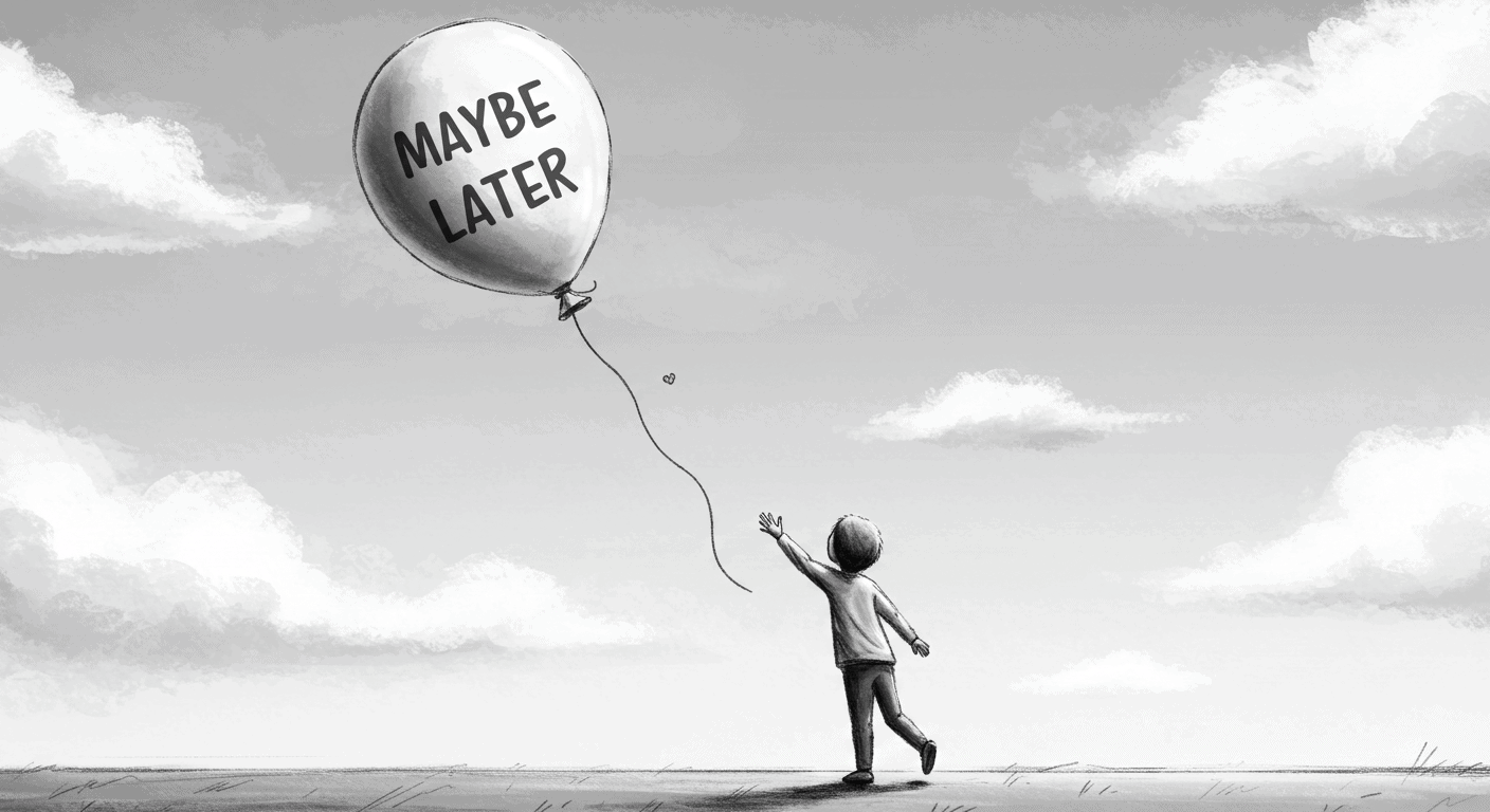
It sounds harmless. Polite, even. “Maybe Later” — the soft opt-out on your modal, onboarding flow, or product tour. A UX safety valve. A peace offering to the anxious user. But here’s the problem: “Maybe Later” almost always means “Never.” And worse — it trains users to avoid learning your product at the very moment…
You’ve been moving fast. The roadmap’s alive. Features shipped, launches announced, maybe even a few investors impressed. But now the product’s feeling… messy. Not broken. Just a bit bloated. A little stiff in places. UX that used to feel sharp now feels like it’s whispering through bubble wrap. If you’re here — you don’t need…
I spent 6 weeks building a feature that saved users 40 minutes per week. Then I skipped it in user onboarding because “it felt too advanced” and “we didn’t want to overwhelm new users.” Discovery rate after 90 days: 27%. 73% of users never found it. Not because it was bad. Because I decided not…
I spent three months tracking settings usage across one product. 127 total settings. 89 visible by default. Users changed an average of 4.7 settings. Not 89. Not 31. Not even 12. 4.7. Democracy in action: you built 89 options, users touched 5% of them. The other 95% just made onboarding take 18 minutes longer and…
I rewrote an error message last month. Changed it from “Oops! Something might’ve gone a teensy bit wrong 🙈” to “This failed. Here’s why.” Form completion rate went from 64% to 91%. Same form. Same functionality. Different product copy. Your product is too nice. Everything says “maybe.” Every modal wants to know if it’s a…


