Most products I audit have great onboarding flows, polished dashboards, carefully designed settings pages. Then you hit the empty state and it’s like someone gave up. A clipart illustration. Generic copy that sounds like it was written by committee. Zero help on what to do next. Your user onboarding can be perfect, but if users…
There’s a quiet crisis in SaaS website design. Too many teams have traded clarity for theater. Instead of sites that inform, we get sites that perform — full of gradients, animations, and positioning so vague it might as well be lorem ipsum. The result? Users scroll. They’re impressed. And then they leave. Modern SaaS website…
There’s a reason your UX copy reads like it was written by a sentient HR policy. It probably was. Not literally. But by the time your crisp, punchy, human line made it through your product lead, your marketing head, your legal review, your VC’s opinion, and your cousin who “has a way with words,” it…
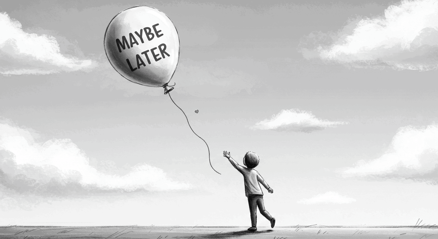
“Maybe Later” appears on modals, product tours, feature announcements, onboarding flows. It’s the soft opt-out — a peace offering to the overwhelmed new user. A UX safety valve. The thinking behind it is reasonable: we don’t want to force anyone. Pushy onboarding is annoying. Users should have control. The problem is what actually happens when…
You’ve been shipping. The roadmap is moving, features are live, users are paying. But somewhere in the last few months the product started feeling… thick. Not broken – functional. Just harder to use than it needs to be. The onboarding that used to feel clean now has two extra steps nobody can explain. There’s a…
Every SaaS team hits the same wall around 10-15 features: the interface feels inconsistent, new features take longer, and someone suggests building a design system. Six months later: 83 Figma components, 40 pages of documentation, developers using it about 23% of the time. The rest is cowboy code with “urgent deadline” justifications. I’ve watched this…
47 features. That’s the average number of features listed in a SaaS pricing page comparison table across the 31 pages I’ve audited over three years. B2B companies, $500K to $50M ARR. Here’s what those 47 features produce: 3 minutes 47 seconds of staring, a 64% bounce rate, and 2.3 features actually compared before the visitor…
I spent 6 weeks building a feature that saved users 40 minutes per week. Then I skipped it in user onboarding because “it felt too advanced” and “we didn’t want to overwhelm new users.” Discovery rate after 90 days: 27%. 73% of users never found it. Not because it was bad. Because I decided not…
I spent three months tracking settings usage across one product. 127 total settings. 89 visible by default. Users changed an average of 4.7 settings. Not 89. Not 31. Not even 12. 4.7. Democracy in action: you built 89 options, users touched 5% of them. The other 95% just made onboarding take 18 minutes longer and…
I audited a SaaS homepage last year that took three paragraphs to explain what the product actually did. Bounce rate: 73%. Time on page: 11 seconds. The founder was confused. “But our sales team loves the copy. The investors said it was compelling. Legal approved every claim.” Cool. Your buyers still don’t understand what you…