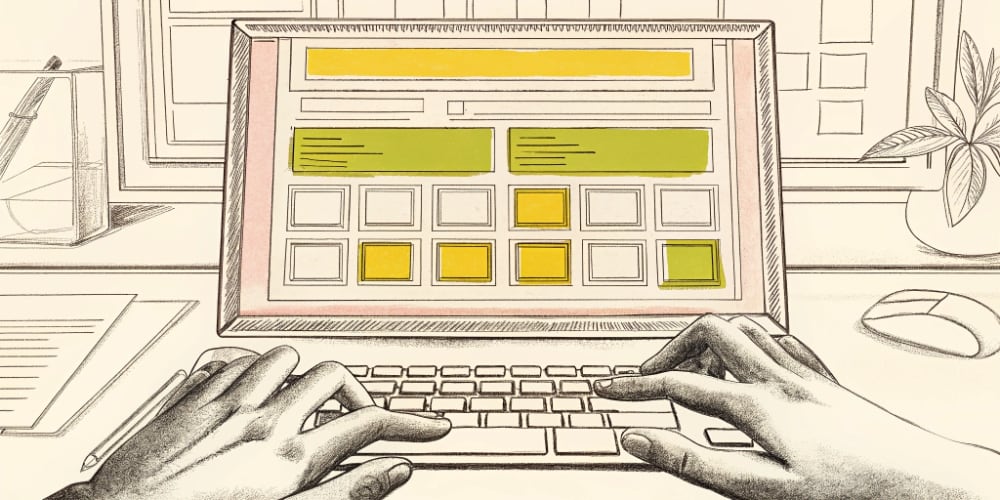
The wireframes looked perfect. Clean navigation. Clear hierarchy. Logical flow. Three stakeholders approved everything in 45 minutes. “This is exactly what we need.” PM scheduled development to start Monday. Then the designer added real content. Product names weren’t the placeholder “Product Name” shown in wireframes. They were 43 characters with special symbols and line breaks:…
B2B analytics platform. Six months post-launch. 1,400 trial signups. 83 paying customers. That’s 5.9% conversion. Founder: “Maybe our onboarding needs work. Or the trial’s too short. Should we extend to 30 days?” I pulled the usage data. 67% of trial users logged in once, clicked around for 4 minutes, never came back. The problem wasn’t…
The job posting said “Product Designer.” Responsibilities included: user research, wireframing, prototyping, visual design, design systems, stakeholder management, A/B testing strategy, and “owning the product vision.” Basically: eight jobs disguised as one title. I asked the recruiter what made this a product designer vs UX designer role. Long pause. Then: “Product designers are more strategic.”…
The UX writer opened the staging site. Clicked through the onboarding flow. First button said “Proceed to Next Step.” Second screen: “Click Here to Continue.” Error message when she left a field blank: “Input required. Please try again.” Empty state in the dashboard: “No data available at this time. Please check back later.” She counted…
I’ve been designing products for enterprise SaaS companies for eight years. Deutsche Telekom, IQVIA, D.E. Shaw Group. The kind of products where a bad UX decision costs millions and ruins someone’s quarterly bonus. Never mine, unfortunately. Technical debt is familiar territory: ship fast, promise “we’ll refactor later,” codebase gets messy, developers slow down. UX debt…
Got a Slack message Tuesday afternoon. 2:47pm. “Quick question – can you design our new checkout flow by Friday? Just needs to look clean. We’re launching Monday.” I asked: “When did you start planning this launch?” “Three months ago. We’ve been building it since October. Just need design now.” Three months of planning. Eight weeks…


