Design
Got an email at 3:47 AM last Tuesday. “Can you change ‘enterprise-grade security’ to ‘bank-level security’ on our homepage? Investor call at 9 AM tomorrow and they kept asking about banking compliance.” Founder. Series A. Raised $8M. Could not change seven words on his own website. Worse: His developer was on vacation for two weeks.…
Got an email Tuesday morning. “Hey, can you do a quick design audit? We think our dashboard needs a refresh. Shouldn’t take long — just want to check if anything looks off. Can you turn it around by Friday?” Friday was four days away. “Quick design audit” is the second-most optimistic phrase in product development.…
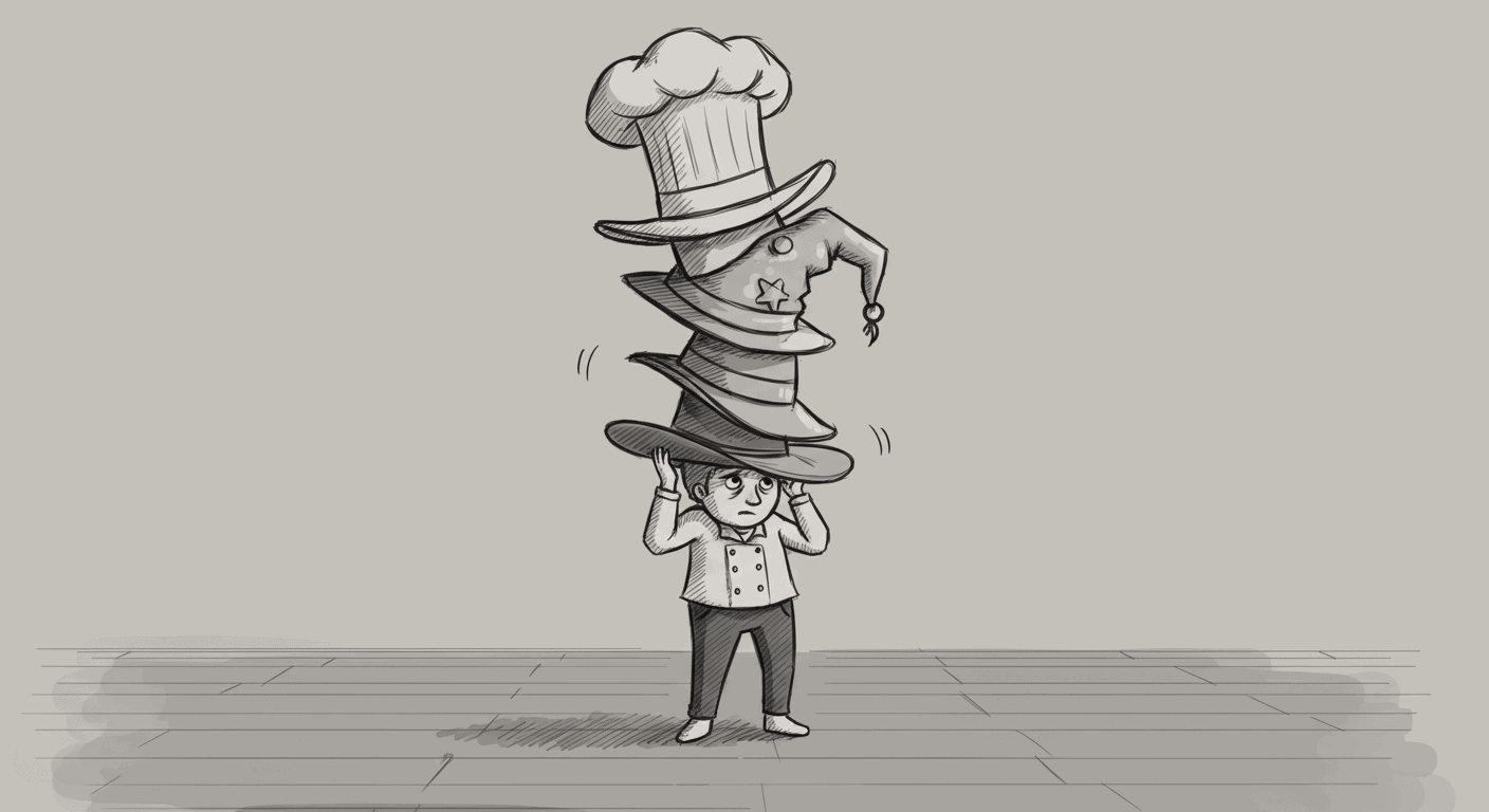
This post isn’t a polite reminder. It’s a cautionary tale. A reflection, really — on every well-funded, well-intentioned product team that decided to hire a UI/UX designer… and then slowly suffocated them in a pile of Slack threads, Notion checklists, and “just a quick thought” Figma comments. Let’s call it what it is: pixel micromanagement…
Got brought in to help a well-funded American startup with their “revolutionary” product. They’d already spent $250K on branding. Had a complete brand book. Army of marketing consultants. Pre-approved UI kit. Moodboards for days. Looked impressive in investor presentations. Then I asked to see the actual product flows. “We’re still finalizing those,” they said. “But…
Got a call from a designer friend last year. Voice sounded tired. “Remember that client I was excited about? The fintech thing?” “I’m two months into fixing what a design package agency did. It’s all garbage. And the client’s out of money.” “Yeah, what happened?” (This is how most design package stories end.) The Setup:…
Design RFPs have a reputation — and not a flattering one. Speaking as someone who’s spent years inside big design teams and consulting for large product organisations, I can say this bluntly: most RFPs are a mess. They reveal more about a company’s internal politics than their actual design goals.They’re often contradictory, stuffed with self-important…
I spent eight months working as Creative Director for a large, well-funded product team. Big budget, talented people, genuine ambitions. Watched them add features like collecting Pokémon cards. CRM. Then dashboards. Then analytics. Then automation. Then AI (of course). Each addition made perfect sense in isolation. Each one had a business case, user requests, competitive…
Most products I audit have great onboarding flows, polished dashboards, carefully designed settings pages. Then you hit the empty state and it’s like someone gave up. A clipart illustration. Generic copy that sounds like it was written by committee. Zero help on what to do next. Your user onboarding can be perfect, but if users…
There’s a quiet crisis in SaaS website design. Too many teams have traded clarity for theater. Instead of sites that inform, we get sites that perform — full of gradients, animations, and positioning so vague it might as well be lorem ipsum. The result? Users scroll. They’re impressed. And then they leave. Modern SaaS website…
There’s a reason your UX copy reads like it was written by a sentient HR policy. It probably was. Not literally. But by the time your crisp, punchy, human line made it through your product lead, your marketing head, your legal review, your VC’s opinion, and your cousin who “has a way with words,” it…