Every SaaS team hits the same wall around 10-15 features: the interface feels inconsistent, new features take longer, and someone suggests building a design system.
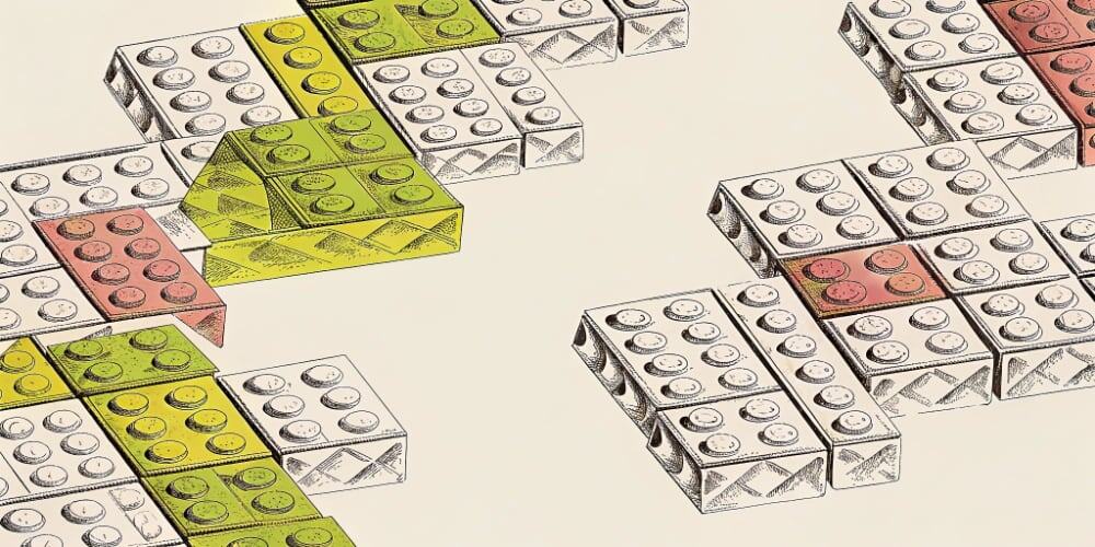
Six months later: 83 Figma components, 40 pages of documentation, developers using it about 23% of the time. The rest is cowboy code with “urgent deadline” justifications.
I’ve watched this enough to know: the problem wasn’t needing a design system. It was needing shared understanding of how your product behaves.
TL;DR: Why Design Systems Fail (And What Works Instead)
Design system reality:
- 4-6 months to build, 40+ hours/month maintaining
- 80+ components created, 23 actually used
- 20-40% adoption (when you’re being optimistic)
- Democracy in action: 47 slightly different buttons, all documented
Modular thinking:
- Start today, 5-8 hours/month maintaining
- 8-12 patterns needed, 90%+ adoption
- Same consistency, 80% less theater
Why design systems fail small teams: Product evolves weekly (system outdated by Tuesday). Nobody has 40 hours/month for maintenance. Devs bypass it when deadlines hit. You documented components, not behavior.
What modular UX means: Repeatable flows (how things behave). Shared vocabulary (stop calling it three names). Content logic (when to show what). Lightweight reuse (where it matters).
Six months building a system. Five different modal patterns still shipping. Guess which one users notice.
Why Design Systems Fail Small SaaS Teams
Here’s what I keep seeing when a 10-person SaaS team decides to “invest in design systems”:
Months 1-2: Audit existing components. Discover 127 buttons. Forty-seven are “slightly different blue.” Four meetings about “primary” vs “accent.” Nothing ships.
Months 3-4: Build Figma library. Write guidelines nobody reads. Create 83 components. Feel accomplished.
Months 5-6: Train team. Migrate screens. Three weeks estimated, seven actual. Eighty-seven Slack messages about button variants.
Month 7+: Product ships new feature under deadline. Doesn’t match system. Designer creates new variant. Adoption plateaus at 23%. Someone schedules “design system 2.0” kickoff.
The system became another project. The product kept moving without it.
You built infrastructure before establishing shared understanding. Cart, meet horse.
What Modular UX Actually Means (Without the 6-Month Project)
Modular thinking isn’t about components. It’s about behavior.
Repeatable Flows (Not Reusable Components)
A button isn’t a pattern. A deletion flow is.
How do users delete something in your product? If the answer is “it depends which feature,” you don’t have a pattern. You have chaos with consistent styling.
Once users learn: warning → confirm → complete → feedback, it works everywhere. No component library required.
Consistent Vocabulary
If your product calls the same thing “Project,” “Workspace,” “Hub,” and “Dashboard,” the UX is broken before you design anything.
Agree on names. That’s not a style guide. That’s basic coherence.
Content Logic (Not Templates)
You don’t need exact copy documented. You need rules:
- Empty states: What can user do now?
- Errors: What broke + how to fix
- Success: What happened + what’s next
Lightweight Component Reuse
Use the same modal structure, input fields, navigation pattern.
Don’t spend six months building 83-component Figma libraries that go stale when priorities shift.
Build 8-12 core patterns. Make them good. Use them consistently. Move on.
Named Products: Who’s Doing It Right (And Wrong)
Linear & Notion: Modular Without the Overhead
Linear: Keyboard shortcuts work consistently. Command palette does everything. States unified. No 40-page docs.
Notion: Core blocks behave the same. Slash commands everywhere. Drag-and-drop follows one rule.
Result: Products feel cohesive. Teams ship fast. Users learn once, understand everything. No maintenance burden.
Stripe: Component Library That Works
Why it works: Product stable (not pivoting weekly). Team large enough (dedicated systems team). System codified existing behavior (documented after, not before).
If you’re a 3-person startup comparing yourself to Stripe: you’re not Stripe. Stop cargo-culting their infrastructure.
The Design System Graveyards
You know what’s beautiful? Design systems with:
- 83 Figma components
- 40-page documentation sites
- Automated design tokens
- Color contrast ratios calculated to three decimal places
You know what’s also common? Those same companies with settings pages that look like five different designers worked on them without talking.
23% adoption. The system became the product. The actual product became an afterthought.
Peak infrastructure. Zero impact.
What to Avoid: The Modular Traps
Trap 1: Repeating Bad Patterns at Scale
Consistency doesn’t fix broken UX. It just scales the breakage faster.
I’ve seen teams make their clunky modal flow “modular.” Now every modal is clunky the same way. Congratulations on industrializing mistakes.
Fix the pattern first. Then repeat it.
Trap 2: Confusing Documentation With Understanding
A Notion page doesn’t mean your team understands how the product behaves.
Modular thinking shows up in conversations: “Does this match our deletion pattern?” “I’ll use existing modal logic.” “New pattern or existing?”
Not in documentation. If you’re writing docs instead of talking, you’re solving the wrong problem.
The 4-Layer Modular Framework (Start Here, Not With Figma)
Layer 1: Vocabulary (Week 1) Name the 5-8 core things in your product. Name the 3-5 key actions. Enforce consistency.
If your team can’t agree on what to call things, you’re not ready for component libraries.
Layer 2: Flow Patterns (Week 2-3) How do users create things? Delete them? How do errors work? Success?
Answer once. Apply everywhere.
Layer 3: Content Logic (Week 3-4) When show tooltips? What do empty states say? What goes in modals?
Rules, not templates.
Layer 4: Component Reuse (Ongoing) Use the same buttons, inputs, modals. Don’t create new patterns without reason. Review monthly.
Total time: 2-3 weeks setup, 5-8 hours/month maintenance.
Compare to: 6 months building, 40 hours/month maintaining, 23% adoption, mounting frustration.
The Uncomfortable Truth About Design Systems
Most small SaaS teams building design systems are solving the wrong problem.
The real issues: PMs requesting one-offs without thinking about patterns. Developers shipping under deadline. No design leadership. Product still figuring itself out.
A design system won’t fix those. It will give you 40+ hours/month maintenance, false consistency, pretty docs gathering dust, and another failed project.
What works: shared understanding of how your product behaves.
Not more Figma components. More conversations. Not more documentation. More coherence.
The product feels easier to use. Easier to build. Easier to change.
Because the problem was never complexity. It was chaos pretending to be strategy.
You don’t need 83 components to fix chaos. You need 8 patterns everyone follows.